 Since this brief is looking at different materials i'm wanting to create three separate typefaces to represent the materials. Above listing words i'd associate with them.
 Friday, 18 February 2011


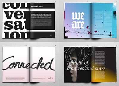
 Above looking at fold and layout, another element i'm wanting in my own work. I'm interested in seeing how fold can make the audience more engaged in the design.


 Engaging focus on shape and form. The weight of the type is an interesting contrast to the plain background.
 The designs im looking at are very type driven focusing on engaging the audience with shape and form, elements which i want this brief to have.
Thursday, 10 February 2011
Wednesday, 9 February 2011
Subscribe to:
Comments (Atom)


