Showing posts with label ougd303dp. Show all posts

Friday, 3 June 2011

Evaluation

I always find it hard to begin evaluations, so many things run through my mind that im never sure where to start, so maybe its best to start at the beginning of this module.

After Design Practice 3 i though my rationale would be 'Research driven publications with a focus on typography, layout and its relationship with photography,' However coming into FMP and writing my initial briefs I didnt feel the need to involve photography. My rationale changed to 'Research driven publications focusing on typography and its relationship with layout.' This focus has stayed the same throughout the FMP. Every brief i have completed has had a reflection on my rationale. However not every brief has been as successful as i hoped.

The concept behind Wood/Metal/Plastic brief is good, in my opinion. The idea that students should get a pack to open and pull out posters and booklets. Booklets that can be folded in different ways and connect in different ways for students to engage with sounds like a great idea. However although the typefaces i designed for the brief, the posters and packaging im happy with, the booklets didn't work out as i initially planned. The stock i used tears after folding and the poster space bled into the negative space where the text it. Along with this the joints to connect pages to different pages doesn't work very effectively. However after contacting different printers i was able to receive advice on stocks which can be seen on my blog.

Not all my briefs were a disappointment, in fact theres a few which i think were very successful. My boxing posters turned out very well and directly connect to my rationale. As I began the designs for the posters i thought they had to be readable to work. Having made them i realised that they work very well as decoration. They are very aesthetically and although they are very readable they still complete the brief. Aimed at boxing fans and to be a reflection on specific boxers fighting records these posters work well as memorabilia .

Another successful brief is the Wood Joint brief. Aimed at school students to educate them on different wood joints, on how to construct them and what they are used for. The packaging is an actual comb joint box and the content cleverly carries on the them of wood. Having designed a typeface for this brief based on the lineal shapes that can be seen from wood joints. It clearly connotes wood and aesthetically looks coherent to the packaging. On the down side the typeface isn't very legible which is something i had to address. Rather than changing the typeface which is successful in the way it relates to the content of the brief i simply introduced subheadings to reinforce the typeface.

As far as skills go this final project has enabled me to further develop my skills in using layout and typography effectively in communicating message. I feel i've become ever better at making things look good, but more importantly im increasingly better at making sure my work effectively communicates to a specific audience. What i've learnt over this year is the importance of research, up until the end of the second year i would guess what is appropriate, and i would design out of my head in the hope it would be original. Now when i begin a brief i research into my audience to see what design works for them. I also research into designers that work in similar ways to myself so i can feed off their ideas, take elements of their inspirational work and develop it into something that works for me and my audience. I believe its this kind of working that creates successful design. It's these skills and logical thinking that i will be taking with me from this degree.

Thursday, 26 May 2011


Finally we can see the work in the appropriate place for them to be purchased, within boxing gyms, and gyms at the front desk.
These photos show the brief working in context as tickets can be bought from your local gym or boxing club.
As an added element to the packaging, rather then print onto the packaging i printed stickers with the title 'The Greatest' on them. The theme the greatest has run through all the products so only right that its titled The Greatest. So along with the ticket, the posters, the booklet, the hard back, it also comes with a set of stickers which is shown on the packaging.


Wednesday, 25 May 2011

I took the type i was designing for 'strength' and made the full upper case typeface for it. Works well!

Same as the Wood Joint brief i've spent some time exposing the typefaces ive created into promotional posters to highlight how they work in different scales. I suppose the briefs i've done through this module show how the typefaces can be put into context.


Having put a lot of effort into the typeface earlier in this brief i thought now at the end it would be nice to have a promotional poster to highlight the typeface and showcase it working in different scales.


Due to lack of organisation and time left to submission i am unable to do the packaging to a professional level. I think the above is, ok, as a mock of what the packaging would look like although i have done a fairly bodged job of it. Having done it with bits of glue, paper, cellotape, sweat and blood there are quite a lot of errors, which is why i wont be handing this in for submission however it does look fairly decent in photos which im happy about. If i'd had more time left i would have put more thought into this aspect of the brief to produce a more professional product.

The outside of the packaging (seen above) has a finished quality to it. I like the clean simple look the packaging has. By being clean and simple it has a more expensive look to it rather than being covered in tacky looking graphics which a lot of similar products tend to be.
The booklet, posters and ticket all need to be packaged, hence the above. Playing with minimal ideas for cost efficiency when it comes to production. Simple use of card to separate the three products is all i feel is necessary. This brief is set to promote the tickets, when people are given 'freebies' they don't tend to expect expensive packaging hence this needs to be rather minimal.


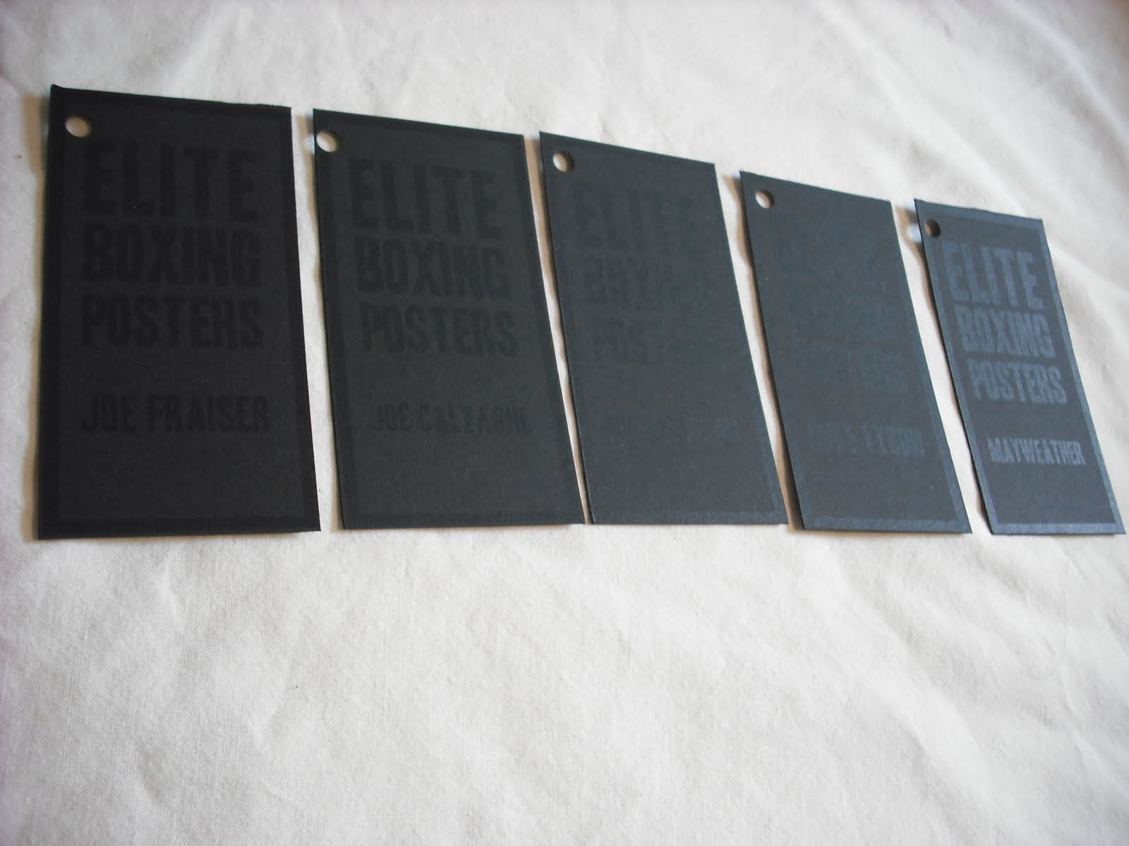
Above we can see how the set works together. As a set i think they work great. If i had more time i would put more thought into the packaging. The title at the back 'elite boxing posters' is too low, once posters are put into the box the title is being covered up which is a shame. Also the stock used here is fairly flimsy. If i was to send this into production i would be using card over 300gsm. Otherwise im very happy the tags and posters and the concept of the packaging, i think as a set they work very well together.

Again screen printed these to go with the packaging, it would be a shame to digitally print the last aspect of this brief.
To ensure the customer knows which poster they're buying I've designed a set of tags to be tied to each poster. The tags are straight forward to make sure they don't take away the excitement of the poster. They're simply laid with the type aligned on the left and right like the posters and within a long narrow rectangle to connote the posters.