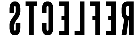
As an interesting engaging piece of work i think this works well. On first sight the viewer is intrigued however fact is it is very difficult to read still. It is readable but takes a bit of effort. However if i was to put this next to the passage of text sat in a simple paragraph i think the majority of people would respond a lot better to this work. It's also appropriate in the sense that this work looks at playing with type and how type can communicate which is essentially research for school pupils to refer to in their own work.