Thursday, 3 March 2011


Above are layouts i'm becoming more happy with. Type and most important elements in black to stand out over background. background there to be aesthetically pleasing.


Introduction of colour to make the page more engaging. Above testing large positive spaces of colour.
Started playing with the type within the column grids, becoming more engaging.


Ok i'm wanting my design to be a long strip, accordion folded, when folded each page will be roughly a5 size.

Above is a serious of layouts, demonstrating my thought process and design developement. Below shows chemical structure which i'd like to incorporate in my design.


From looking at chemical structures i've used these shapes to create my typeface. Below we can see a variety of formations for the letter A


Friday, 18 February 2011

Since this brief is looking at different materials i'm wanting to create three separate typefaces to represent the materials. Above listing words i'd associate with them.

Below my thought process is that i would associate plastics with being man made, chemistry, chemical structure. Therefore below im looking at the chemical structures of different plastics. These lineal shapes may be the basis to the plastic typeface.


Lineal type design, looking at form and shape to display letter forms. Much more interesting then standard typefaces.


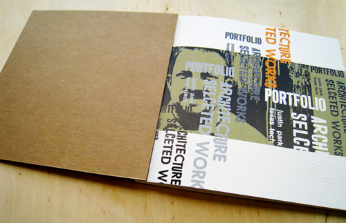
Above looking at fold and layout, another element i'm wanting in my own work. I'm interested in seeing how fold can make the audience more engaged in the design.


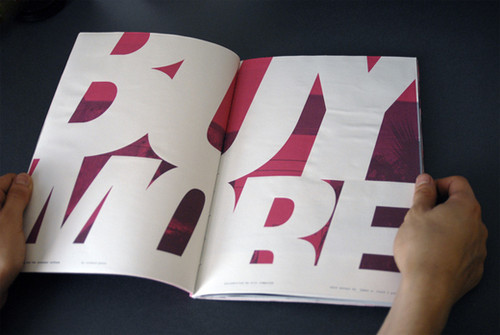
Engaging focus on shape and form. The weight of the type is an interesting contrast to the plain background.

The designs im looking at are very type driven focusing on engaging the audience with shape and form, elements which i want this brief to have.