
Monday, 31 January 2011
 I didnt feel like i own the typeface on the left since its simply a manipulation of an existing typeface, so rather than playing with negative space on positive im simply using the lines and forms of joints to create a typeface all of which is positive. As we can see on the right the typeface works much better.


Friday, 28 January 2011


Thursday, 27 January 2011
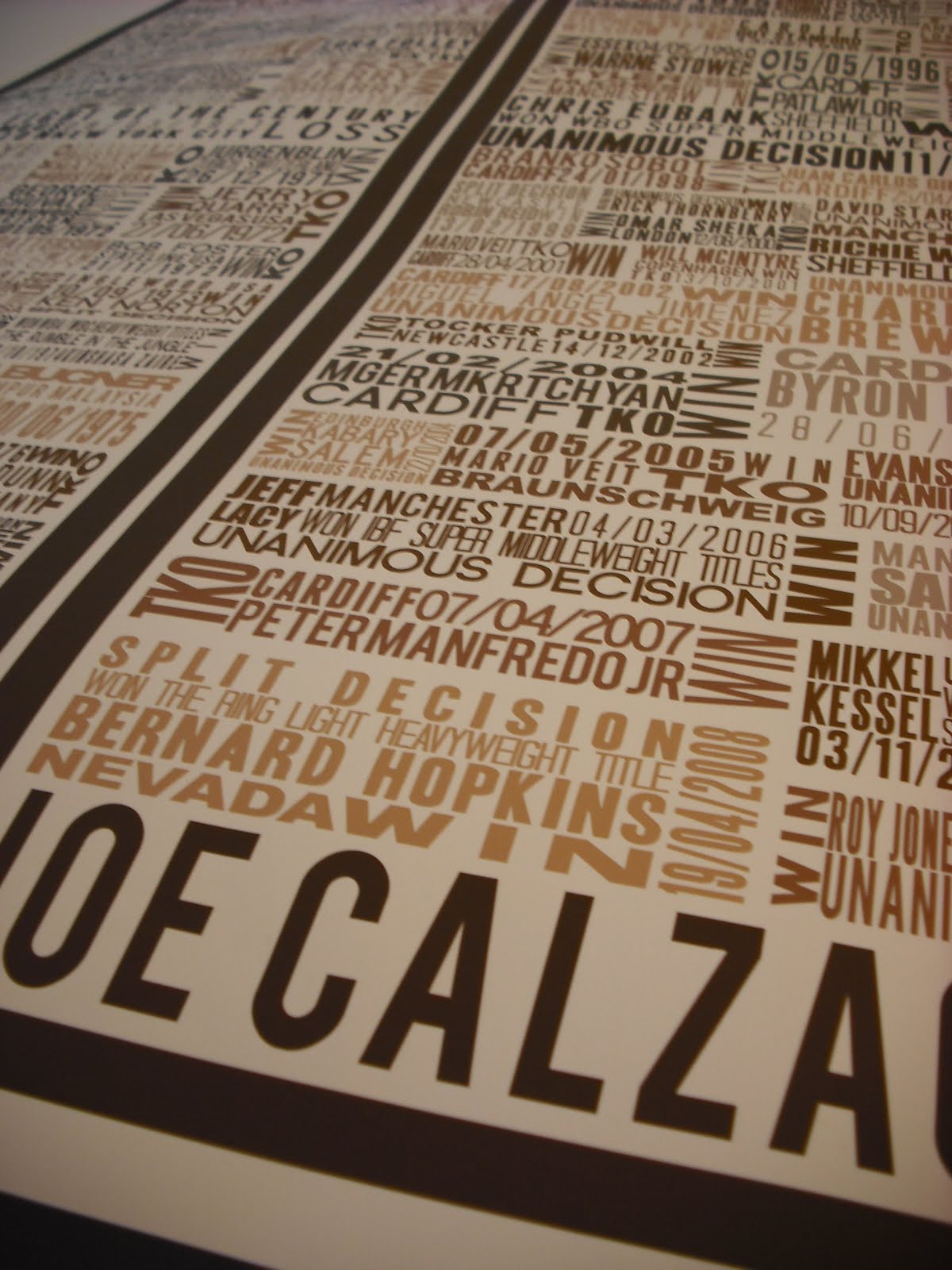


Having printed two of my posters digitally i've decided that printing them in this way simply doesnt do them justice. I think to enhance their aesthetically pleasing quality it would be best to screen print them. The other issue is i dont think the colours are working. It gives some clarity to each fight in the poster but i think i will play with one colour.
Wednesday, 26 January 2011


 Above and below is a small example of the consideration gone into the layout of each and every fight. Having to consider what looks best constantly. I think the above with the light weight type in the middle line brings contrast to the top and bottom line. If they were together the block of text would become more difficult to read and essentially not as pleasing to the eye.


Subscribe to:
Comments (Atom)