

 These photos show the brief working in context as tickets can be bought from your local gym or boxing club.
 As an added element to the packaging, rather then print onto the packaging i printed stickers with the title 'The Greatest' on them. The theme the greatest has run through all the products so only right that its titled The Greatest. So along with the ticket, the posters, the booklet, the hard back, it also comes with a set of stickers which is shown on the packaging.


 The outside of the packaging (seen above) has a finished quality to it. I like the clean simple look the packaging has. By being clean and simple it has a more expensive look to it rather than being covered in tacky looking graphics which a lot of similar products tend to be.


 Again screen printed these to go with the packaging, it would be a shame to digitally print the last aspect of this brief.
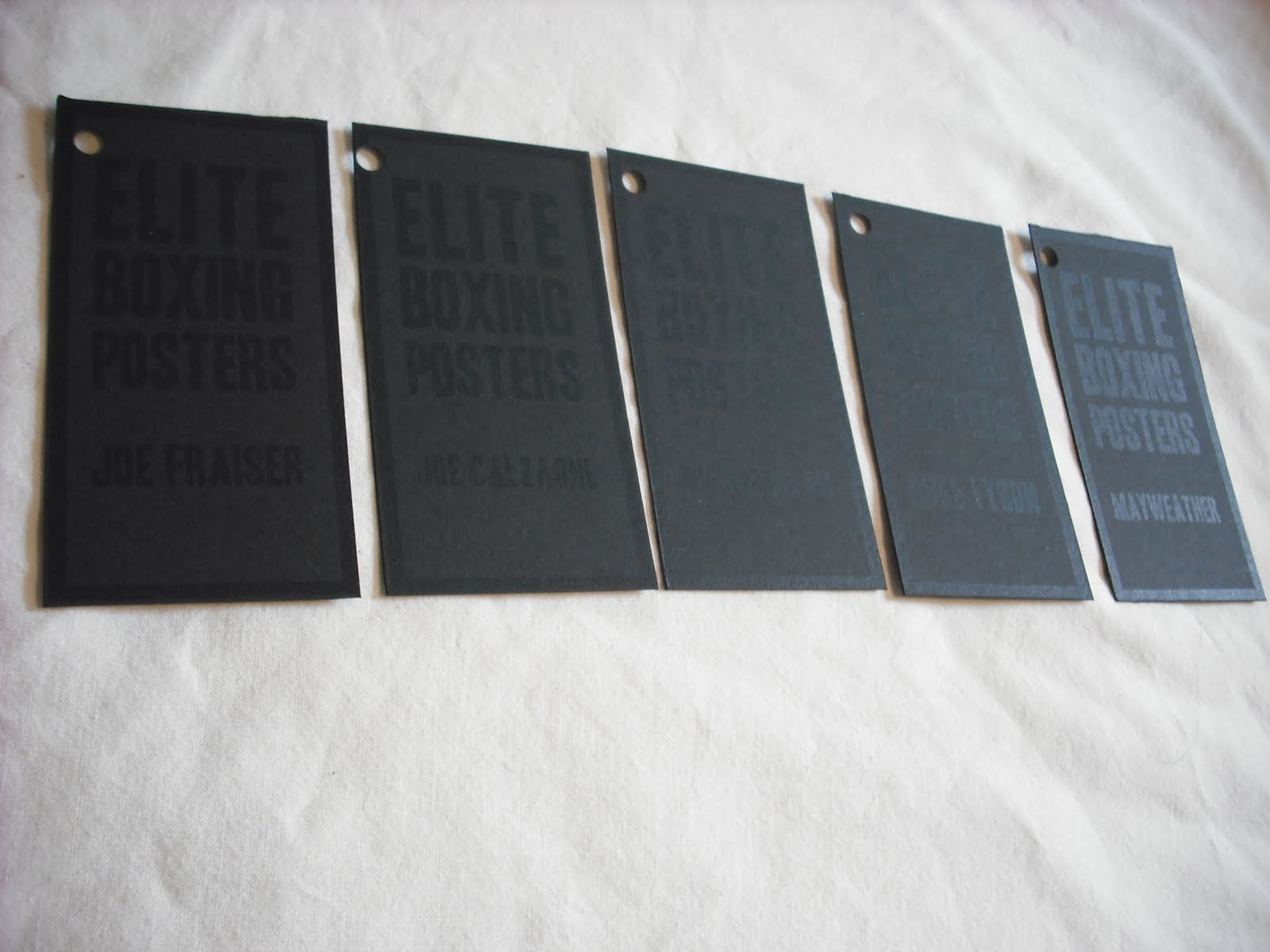 To ensure the customer knows which poster they're buying I've designed a set of tags to be tied to each poster. The tags are straight forward to make sure they don't take away the excitement of the poster. They're simply laid with the type aligned on the left and right like the posters and within a long narrow rectangle to connote the posters.
 Rather than screen printing gold onto white for the packaging i thought it best to use the more subtle of the two or the packaging to not take away too much from the posters themselves. Although i do want the packaging to be pleasing and attractive to the viewer, i want the buyer to want the poster rather than the packaging.
 Having screen printed the posters i didnt want a digital print to bring down the mood of the brief, therefore i've also screen printed the packaging. By covering the packaging in the existing designs from the posters this gives viewers a taster of what the posters will be, since the posters come rolled up it seems appropriate to allow them to see a preview of the design.


 Think this brief has been a success, especially to say its only been a day brief. The typeface works well with the content as well as being rather engaging. The booklet answers the brief well by explaining different production techniques in a clear effective way that isnt text heavy which pupils would get board off.


